
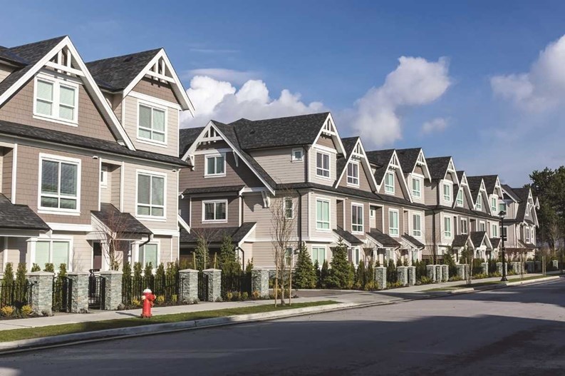
Depending upon whom you ask, the uniformity of condominium exteriors seen in New England (and elsewhere) is a matter of developers playing it safe and/or saving money. Visitors to a condominium community expect to see a light, monochromatic property with uniform curb appeal, free of distracting color or material elements, with nearly identical units.
Admit it: that visual in your head is pretty one-dimensional. As condos rise in price, stylized variations do occur—light grays, bronze or custom design elements in the yards, striking lighting—still uniform, but a little off the grid. There are reasons for uniformity, often written right into the association rules. Over time, upkeep and modernizing may change color tones, but uniformity is predictable—even among high-end properties.
That’s not a bad practice, developers and designers agree. While it may be awkward giving directions to visitors when there are no obvious distinctions, nobody wants to wake up to a purple (the commonly held color of condemnation) neighbor. Property value is hugely connected to color and design conformity. Purple is hard to sell. Beige is safe, timeless. Brick is solid. Condo design shouldn’t rely on what's trendy, several consultants say.
A Neutral Color Palette
Barbara Jacobs, of Barbara Jacobs Color and Design, a Boston-area architectural color consultant, assists in color selection for interior and exterior walls or other surfaces. She says function drives many decisions. “One can’t please everyone all the time, so we have to go with what’s best for the space, the architectural features, materials and lighting, the condition of the building—the details. Really, we just try to do what’s best for the location in an overall sense.”
The goal is lasting appeal. “Because all materials—natural and man-made—have color, everything is subject to a color decision,” Jacobs said. “In a building, this includes roofing, siding, stone work, and interior materials; it all has to work together. Color is more than decoration. The importance of the psycho-physiological effects of color, and the relationship between visual ergonomics and color, are all part of how the built environment influences well-being.”
Visual ergonomics refers to design and color placement that provides the best sight conditions for locating specifics and using the environment comfortably. “Whether the subject is exteriors, interiors, or multiple-building sites, we always consider many aspects of the surroundings, as well as the types of activities and requirements of those who will use the buildings,” Jacobs said.
So, is all-beige the most healthful then? Well ... it is on the budget. Jacobs cites a lowest common denominator factor. “I’m not sure who started it—maybe an architect,” she joked. “Among other things is the idea to play it safe. I am not a ‘paint by numbers’ person, or someone who wants to do anything recipe-based or generic.”
An exterior may be made unique without taking away from its overall uniformity or consistency of design, depending on the decisions managers make in doing so. “Leading a horse to water and providing flavors does not mean the horse will drink!” The one invariable element to condo design, she says, is that it is dependent on too many elements and influences for applying effective, pat answers. “There are too many variables. Moderation and evaluation together is the key,” she warns. “We don't want to create a circus.”
Some people do, arguably. Jasmine Martirossian, Ph.D, a management consultant and the author of “Decision Making in Communities: Why Groups of Smart People Sometimes Make Bad Decisions,” says the trouble is mainly due to a minority of homeowners who buy in, then want changes.
“Part of the reason that people buy into condominium living is the predictability and assurances it offers; they have a sense they won’t have to suddenly deal with somebody’s purple house or orange gates. It brings most people peace of mind. Over two-thirds of condominium owners prefer that. It’s the other third that leads to conflict. They think the rules won’t apply to them. People need to buy into condominiums with a recognition of the rules for conformity. Across the states and countries, like Canada, the scenario is the same. If people are not informed about what condominium living entails, they’re not going to be happy residents. It’s not for some people for sure.” Dr. Martirossian has interviewed thousands of people during her career and studies, and works in condominium governance and group dynamics.
Even when they want to make changes, disagreement puts a wrench in association plans. “There was one that virtually spent almost 10 years trying to do a major redesign,” Martirossian said. “They had over 900 units; it was a major association in the Boston area. It was such a torture to process that, in the end, they settled for very colorful carpet schemes that made your head swirl; it was almost psychedelic, hard to look at. They had an extremely colorful interior, but it was not worth 10 years of torture.”
In her own condominium residence, where there are only five units, Martirossian says, the group couldn’t agree on anything—so much so that two designers quit on them. She laughs. “They didn't want to deal with difficult clients. I was new, so I had to step back. When you’re new, you have to. In the end, we paid $150 a roll for wallpaper—it was awfully expensive. You can’t even tell there’s wallpaper on the walls, because they chose such a neutral color, but it was a consensus. That’s a normal process. They ended up with one of those nasty compromise solutions.”
Weighing the Costs
Costs also have weight—“the predictability, the economies of scale in maintenance,” Martirossian says, all play a role. “Cost adds up. Usually, (associations) gravitate toward more neutral tones because they’re thinking about resale values.” Very few ground-breaking changes result.
Architects consider exterior color and design as key factors in attracting new residents. The target market for Thornton Manor in Concord, Massachusetts, built in 1985, was affluent “empty-nesters” who wanted the feel of a single-family home with condominium conveniences. At the same time, the town wanted the rural character of the former farmland preserved when the condominium was built in 1985. Architect John Cole of Arlington, Massachusetts, and Maine designed it with the notion of a manor house surrounded by outbuildings and open land. It was a success. The exteriors of the buildings (a four-plex, duplex, and a single family unit) recall the grand manses of the Victorian era, while the interiors are contemporary and spacious, with first-floor master suites. The market approved; all units sold prior to completion.
“I take my cues from the natural environment,” Cole said. “If it’s in a place where there’s a lot of background trees, I want to make it blend in, so in that case my rule was no white and no white trim. I used just earth tones.”
The opposite might be true in a more urban or colorful setting. “If a building stands out, with a big green lawn around it, and is totally open, I go for contrast,” Cole said. If an area is broken into physically separated units, using complementary colors would work. In Concord, the building design was a large mass, which he had painted in a light shade, “letting the shadows define the architectural detail.” Keep it simple, he says.
Looking beyond the “safe” zones of whites and beiges in New England, Cole also sees a lot of “grayshe”—a light reference he makes to a gray/beige color scheme. “White trim always is popular, in particular with colonial-type styles.”
Mixing It Up?
Some color choices emerge from a market-appeal preference. “Middle of the road is a safe choice,” Cole said. “If you’re doing something more contemporary, or trying to attract a younger, or more adventuresome demographic, you may use a little splash of color.”
Clients just aren’t that prone to mixing it up. “People get pretty conservative,” Cole said. Even selecting colors for mailboxes and other attachments to a property is part of the design, he said. In more upscale areas, residents want to see bronze or color schemes in that direction, connoting class or higher-end lifestyles. “If people are left to their own devices, you’d get a mish-mash of colors and materials. People don’t think about it; it just happens.” Hence, rules.
A Rhode Island developer says the safety net for design is simplicity. “Neutral colors is the only thing we’ve ever done,” said Gregory Richard, a broker and owner of Kirkbrae Properties in Lincoln, Rhode Island. “They’re accepted by a larger group of people.”
Going away from neutral and toward bold colors is risky, and a maintenance issue. “We don’t use paint,” Richard said. “Everything’s got to be vinyl or very low-maintenance materials; that’s why you choose neutral colors. If you go in with the trendy color of the time, five years from now that may not be the color. Then you have to remove it, and the materials, if you want to do something else.”
As everyone knows, the days of extravagance, except on the high end, are gone. One builder recalled being asked to design six different patterns for yard posts before one was chosen; that wouldn’t happen now, he says.
Attorney Stephen Marcus, a partner with the law firm of Marcus, Errico, Emmer & Brooks in Braintree, Massachusetts, and a founder of the New England chapter of the Community Associations Institute (CAI-NE), also sees little variation. He says condominium documents usually require uniformity—“unless the board gives an exception to someone. Perhaps the values are increased by uniformity, as opposed to someone painting their house purple. Everything’s a question of extremes. Designers may feel that flexibility actually increases value, because some prospective buyers may want that.”
Small deviations may be overlooked, but even temporary ones like holiday decorations can become contentious, underlining the need for uniformity. Painted decks and other non-conforming choices lead to disagreements. “We’re only going to hear about the case if the board has taken a strong stance on uniformity, as opposed to having taken the position that it doesn’t care.”
Those who do care have rules, and expect residents to conform. “One of the big problems that does bother boards is that normally to make a change to exterior appearance, residents are supposed to ask for pre-approval. Say I’d like to screen in my porch. If I don't ask for prior approval, sometimes that upsets the board. It might not be that the board doesn’t like what was done, but that the owner didn’t ask permission. Sometimes these cases get resolved with an apology, if the change is something the board can live with,” Marcus said. Boards tend to believe they have opened Pandora’s Box once they say yes. He disagrees. One deviation does not legally bind the association to another request, Marcus says. “We can deal with these things on a case-by-case basis, and allow the one that’s a decent change.”
Ann Connery Frantz is a freelance writer and a frequent contributor to New England Condominium.


Leave a Comment