Many professionals recommend a simple start for cost-conscious renovations, changing things over a period of time, and then keeping up with maintenance—a sort of rolling renovation approach for staying up to date and functional.
First impressions being what they are, designers know it’s best to begin with areas that look old and tired—especially upon entry. For Mary A. Wilczynski and Elise Irish, owners of Spec’s Design Group, Springfield, Massachusetts, the process graduates, literally, to “Lights! Action!” They examine indoor and outdoor spaces for appearance, lighting and usefulness.
Lisa Goodman, of Lisa Goodman Design in Sharon, Massachusetts, encourages managers to think positive. “There are great things they can do to make a space just really beautiful,” she says. Goodman advises against drastic makeovers, unless circumstances (a flood or fire) make that necessary. “It’s disruptive, it’s expensive, and it takes a lot of time,” she says.
Marc Maxwell, AIA, of Maxwell Architects LLC, Somerville, Massachusetts, has designed residential common spaces for condominiums and other large occupancy dwellings. When he’s working with a good interior designer and an involved building owner or manager, he’s found the right formula for success. Maxwell has worked on two very different residential areas with the same owner—Parkside Place in Cambridge, where 251 rental units fill an updated 1960s building, and the 376-unit Tremont on the Commons, an upscale Boston condominium that needed an update from its 1980s design. Parkside and Tremont’s differences are fundamental, dictated not only by resident lifestyles, but community surroundings. (You can view images from both locations at www.maxwellarchitects.com and click to ‘residential.’)
Time Equals Change
Over the life of a building, needs change. “Sometimes a different age group kind of builds within a residence, and you have to look at who is living in the building now—not who might live in it later, or once did,” Goodman says. For a small investment, managers can make a big start with new paint and lighting.
Goodman champions lighting. “Darkness is not a good thing,” she says. “Making spaces inviting involves soft, warm lights, inviting nooks for activities. Think of your favorite coffee spots. Some, like Starbucks, have a culture, a design that invites people to hang in, use their computers, converse.” She calls lighting “short money for big returns. In a dark space, you could have a beautiful carpet and wall art, but if nobody sees it, why do that? Light makes a world of difference, and it can be duplicated on each floor for uniformity.”
Irish agrees. “It’s very important— make sure you’ve got the right kind of lighting to create a nice, warm environment.” Her mantra: Make it clean, fresh, inviting and current.
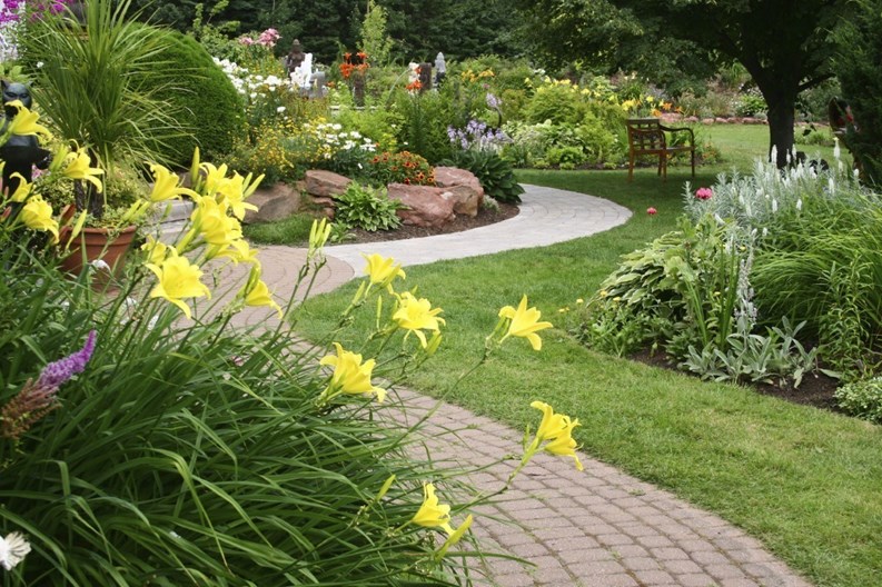
“An older complex may not have taken into consideration that a lot of people are living healthier lives these days,” Irish says. “Part of that is taking walks, utilizing the outdoors more. Maybe they’re looking at hiring a landscape architect and putting in nice walking paths, and water features—ponds or fountains—with nice exterior furniture, benches, or chairs, so that people can take a walk, or just sit down, read a book.”
“We look at how to integrate people, to help them mix more,” Irish says. That thought sparks outdoor grilling areas, with gazebos to eat in or sit beneath— rooms that can be open or enclosed, screening them for bugs. “Maybe there are areas adjacent to the gazebos, so you can have both,” she says. “Indoors, with a kitchenette—a sink and dishwasher for an enclosed meeting room—and an open, exterior area to sit in, if the weather is good.”
There may be gardens to enjoy, or maintain. Paths to walk. Sport courts for a workout. Irish recommends biking paths, since so many people are health-conscious. Updates and additions of this sort, she says, make the exterior portion of the complex inviting.
Inside, exercise equipment works— again for health-conscious residents. “Make them a multi-purpose room, where you can move furniture easily to one side by putting it on casters, allowing the room to be open for yoga or aerobic classes.” With a few adaptations— acoustic sliding walls, screens, and the like—these areas can be used by several groups at once.
“Keep in mind the type of furnishings,” Irish says. “Carpeting can wear and stain. A hard surface, like vinyl flooring or ceramic tile, is better.”
Consider these ideas, says Irish.
• Add a community room kitchen, with a counter area large enough for food preparation and work space— something that’s easily cleanable, and will take wear. That way, crafters, too, can make use of the space.
• “Maybe there’s a corner that’s carpeted. Add a gas fireplace, some tables and chairs for a book club to meet, or add wi-fi for computers, etc.” This provides a cozy area, alongside a larger area for meetings or group activities.
• Stackable chairs, tables that fold and are easily put away in a storage area are wise. “If you have a room that needs to accommodate 20 or 30, it takes smaller size, stackable folding tables—reconfigure the tables in different arrangements for different uses.” A table that’s 30 by 60 inches will probably be more flexible.
• Consider a conversion to a classroom—for speakers, computer lessons or what-not; stackable furnishings again play a role.
A Fine-Tuned Entrance
Goodman, an industrial designer by background, has a strong affinity for furniture makers, artists, glass blowers, and so on, who make fine furnishings. “Sometimes it’s worth spending more on it, if it’s a really fine piece people will enjoy for a long time,” she says. “As someone with some art craft training (glass blowing), I think it’s amazing what they can do.”
Goodman likes to see social amenities—a small wet bar, a refrigerator, café tables, etc. Managers need to make a thoughtful decision, with everything having a reason for being there, she says. “And it should look like it belongs there. Some people won’t notice, but others will, and a well-designed space impresses newcomers and potential buyers, and appeals to those who live there to use those spaces.”
Although fire codes sometimes prohibit gas-operated indoor fireplaces, various styles are perfect for an outdoor seating area during the warmer months.
Indoor/outdoor furniture—tables and chairs, free-standing bars on casters—may bring residents together. Even a movable counter top area, outside or in a function room, is usable all year round, and may save the expense of buying furniture for both locations. “Get multi-use furniture,” she says; “you don’t want it locked down to one location, or looking like patio furniture when it’s brought inside.” A dual benefit: there’s less to store when the seasons change.
Other Recommendations:
• Establish a sharing library along one wall. Book clubs are popular, and members can use a screen or room divider to cut distractions. “I wouldn’t put sofas in, if you want to be able to move things in there. Chairs are easier. Some companies manufacture furniture that is adjustable—you can put the extras on when you need them for tables, crafts or seating.”
• Change the old community room. “Game rooms are very hot now,” Goodman says. “They’re easy to accessorize, visually. And it’s a great way to use common space to appeal to people of different ages.” Make it bright and appealing. “Color on the wall, nice light fixtures, artwork or just a pattern to break up long walls. There are beautiful options in window treatments, drapes, blinds with color. Plants add to a room—people feel better with plants. There are a lot of really hardy plants, but they do require care, so it may be more for an on-site manager to deal with.”
• A TV set no longer takes up space; a flat-screen TV can easily be added to a wall for sports, movie night, or conventional viewing. A word of caution from Goodman: “Remotes can walk, so it requires care. Make sure there are options.”
Cooperative Effort Goes a Long Way
Maxwell emphasizes teamwork in any plan.
At Parkside and Tremont on the Common, the property managers and owner have spent several years making improvements. “The owners have looked at all of their properties for what their precise market is, and what kinds of amenities and facilities are appropriate for the neighborhood and residents,” he says. “Parkside had an abundance of space that a lot of current buildings don’t have. They started in 2004, and they’re still doing a few interior design projects.”
The owners don’t want to wait until the building is so tired and out-of-style that mega-projects and hefty renovation costs are necessary. “They’re constantly looking to make their product as cutting-edge as they can.”
Parkside’s card-playing room became a clubroom; fitness areas were expanded because residents sought contemporary, spacious facilities. They renovated the laundry, lobby and outside entrance. The latter adds visual appeal for potential residents. Also, because many residents had children, a “toddler room” came into being, something quite unique.
Deleting space from unused areas and expanding popular spaces, Maxwell renewed recreational space. Obscured glass blocks provide light and privacy to the fitness area and other rooms facing the outdoors. They retained “beautiful terrazzo floors from the ’60s,” using recessed carpeting on top to update the entryways.
“We used a very creative designer (Cindy Aiguier of Artesania, Boston), who combined a residential feel with more contract finishes (durable materials). She helped maintain the balance of residential and durability,” he says.
Tremont on the Common, in downtown Boston, adheres to its environs. Converted to condominiums in the 1980s, this high-rise was renovated in 1993. It has an upscale, formal appearance. Deciding on common spaces here was not as freestyle as at Parkside.
The emphasis was on class and style, upgrading the lobby and elevators, renovating common area corridors and adding a fitness center. On the roof of the parking garage is yet another amenity—much enjoyed when warm weather finally settles on Boston: a rooftop swimming pool received a larger, contemporary deck.
The formal entry, with granite flooring and dark wood paneling accented by rich colors, is a far cry from the previous era. “It looked like southern Florida,” Maxwell says. “White walls, potted plants—all out of the condo craze of the ’80s.” The owner, however, realized Boston buyers weren’t interested in that, and sought a more formal look, in keeping with Boston’s downtown business aura. Since then, they’ve had only to keep up the building, replacing carpet inserts periodically.
Storage space is critical, not only for residents’ private use but to open up common areas. Recently-built condos accommodate storage bins, finds Jamie Barnard, president of Giant Industries, Queens, N.Y. “They’re such a revenue producer that they’re designing them right into the buildings,” he says. His firm installs Wirecrafters’ storage units—70,000 to 80,000 of them since 1990.
They can also be installed in common areas, but that’s less common, and when done, solid bins are provided instead of the usual wire bins, which are 3 by 4 feet, 4 by 5 feet or larger, custom sizes. They can be installed on a platform as well, for protection against water.
Regardless of one’s choices for common area updates, and their costs, there are a few certainties, the pros say. Durable materials look better and last longer. Stay in touch with residents’ lifestyles. Remember that trendy looks don’t last as long, and can even become “tacky” when fashions change; be prepared for a makeover. Finally, whatever your choice, keep the property well-maintained. That’s good advice in any era.
Ann Frantz is a freelance writer and a frequent contributor to New England Condominium.


Comments
Leave a Comment